












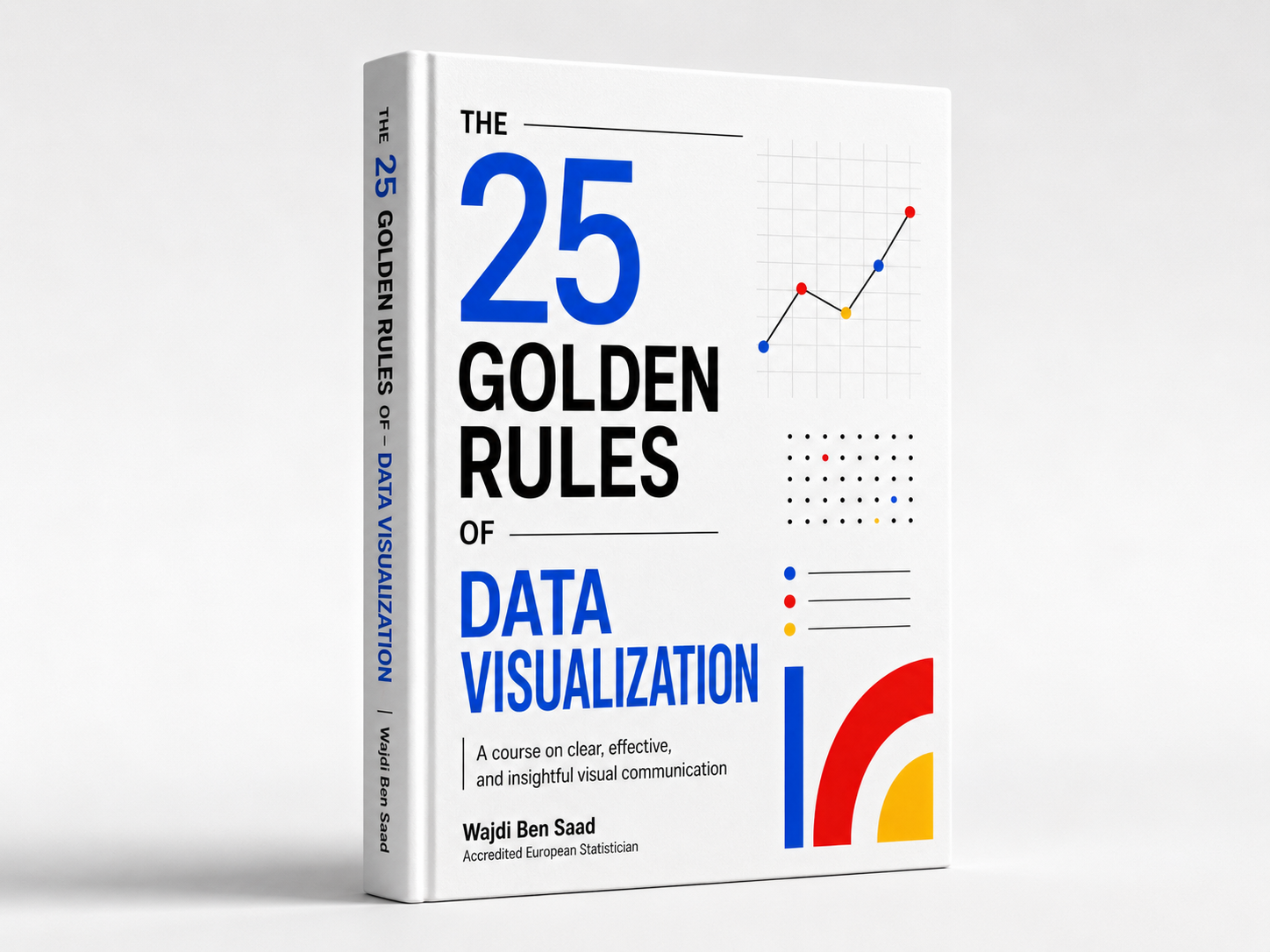
The 25 rules are my way of organizing the most common problems I see in beginner visualizations and in public-facing charts more broadly: missing titles, unclear units, misleading scales, weak chart choices, poor color use, cluttered layouts, and unnecessary complexity.
The whole book is structured around three principles that I consider essential: completeness, so the reader has what they need to understand the chart; readability, so the chart can be decoded quickly; and integrity, so the visual does not distort the data or push false conclusions.
I designed it so it can be read from beginning to end, but also used as a working guide. I do not want the rules to be treated like rigid commandments. I want them to help people understand what each rule protects, when it matters, and what kind of mistake it helps prevent.